Context
Biogen, a pharmaceutical company specializing in neuroscience, created BHS (Biogen Healthcare Solution) to design, develop, and deliver innovative digital solutions for patients with neurological diseases and healthcare professionals. Cleo is one of these solutions, a mobile app designed to support people living with multiple sclerosis (MS) and their communities.
MS is a condition that affects the brain and spinal cord. While there is no cure, treatments can help manage symptoms and slow disease progression.
Mission
I joined the project once an early draft of the design was in place, a set of standalone screens without user flows, structure, or documentation. Development had already begun based on these initial layouts, and my role was to bring coherence, usability, and quality to the product.
My mission then focused on three main areas:
- Accessibility
Making the app adaptable and easy to use for people experiencing MS in very different ways. - Engagement
Encouraging daily use and helping users feel supported while tracking symptoms and programs. - Quality
Ensuring high product standards through clear prototypes, guidelines, and thorough QA.
Tool used
 Sketch
  Zeplin
  Framer
  Flinto
  Invision
  Photoshop
  Illustrator
  After Effect
 Target Users & Deployment
Cleo is designed primarily for people living with MS, helping them understand their symptoms, track daily experiences, and manage their condition with more confidence. Caregivers and clinicians are secondary users, benefiting from clear symptom histories and structured tracking.
During my time on the project, Cleo was deployed internationally across France, Italy, Germany, Canada, Japan, and the US, with each version adapted to local requirements.
App overview
Cleo helps people with MS by offering information, support, and tools to manage daily challenges. The app has four main sections: Explore, Program, Journal, Chat, and a Home as a shortcut hub.
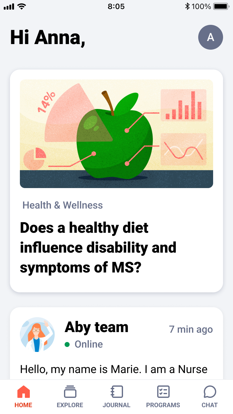
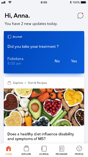
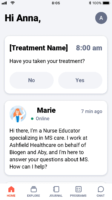
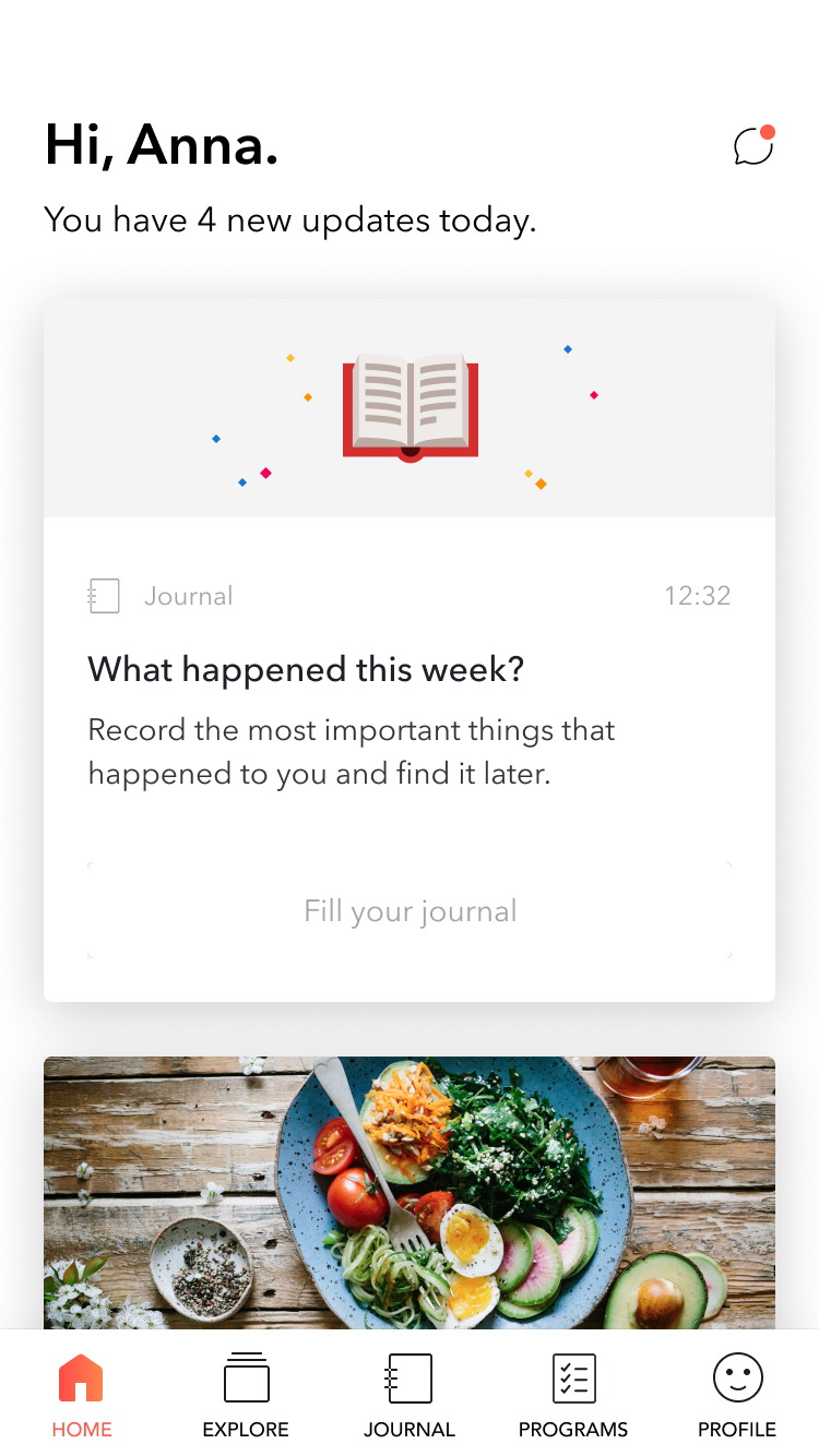
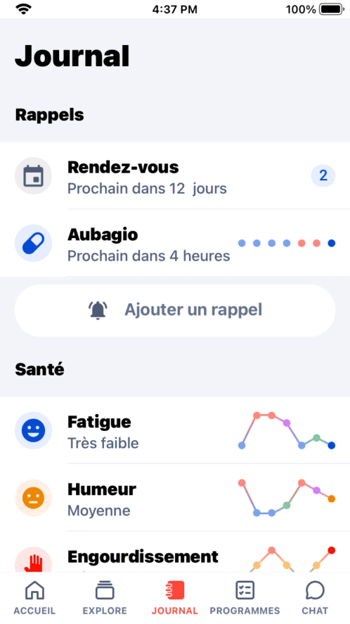
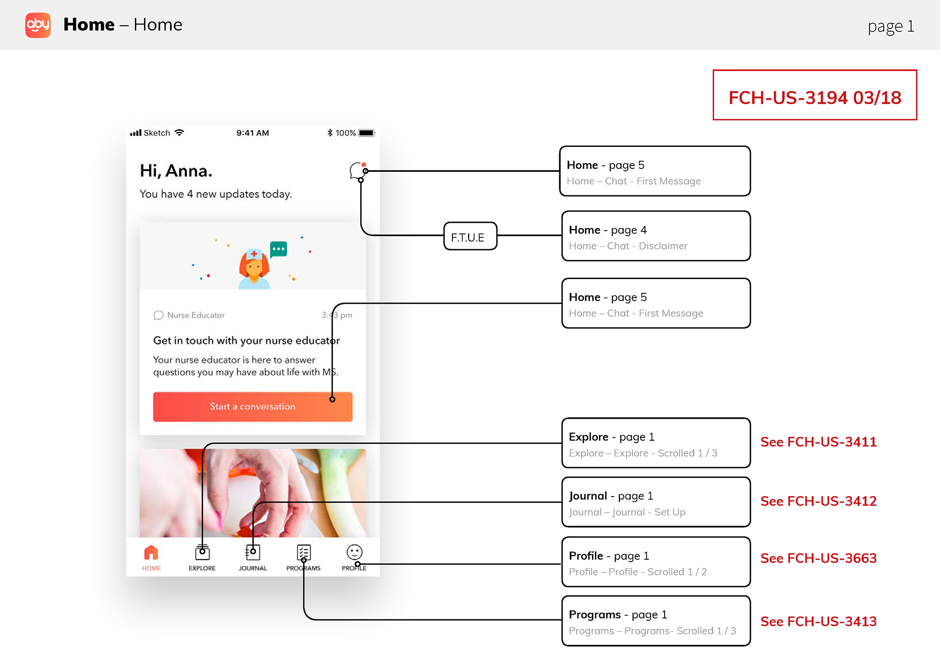
Home
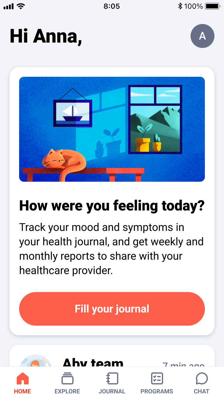
The Home screen serves as Cleo’s central hub, offering a quick snapshot of the day: reminders, journal entries, program activities, articles, and personalized suggestions.
Its goal is to act as a daily companion that helps users stay on track with their routines and health goals.
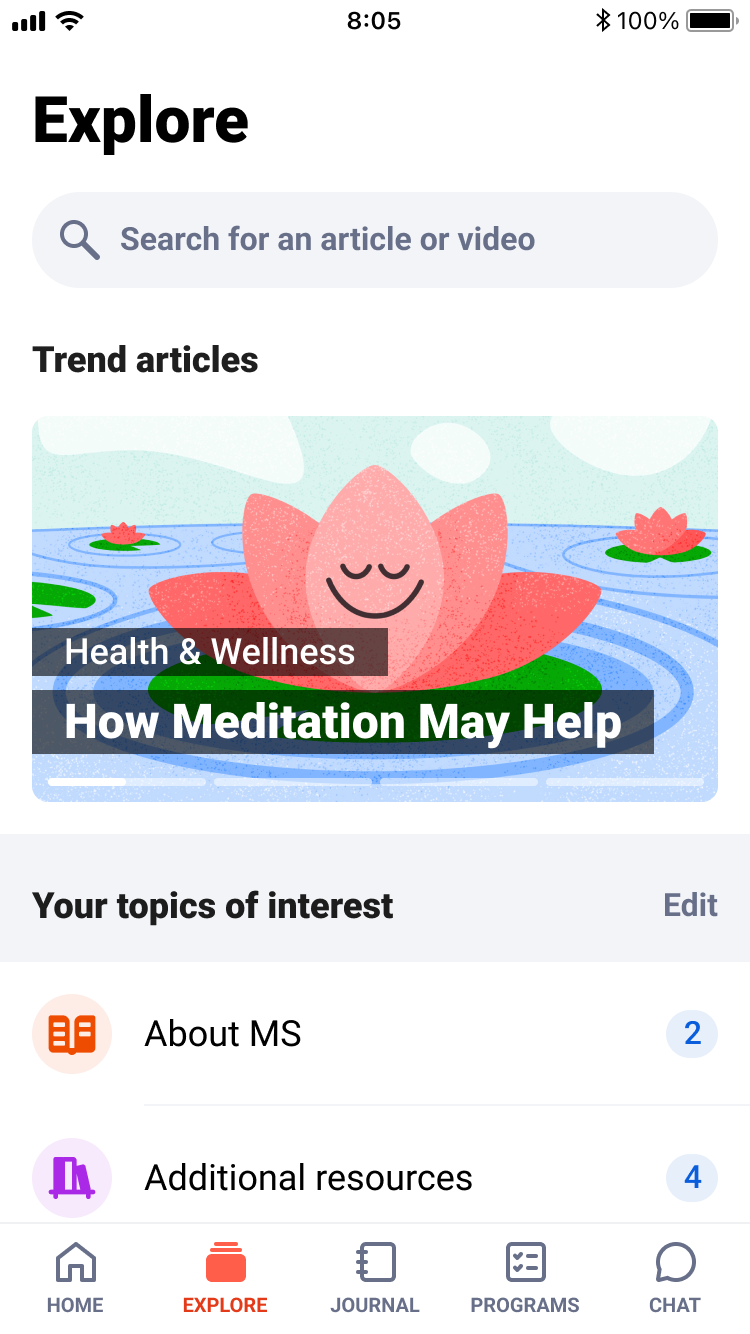
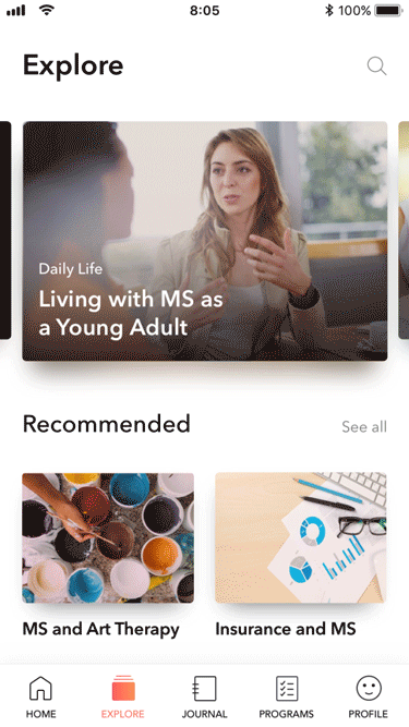
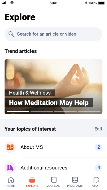
Explore
The Explore section offers educational and supportive content on MS, including articles, videos, quizzes, and testimonials, either created specifically for Cleo or curated from trusted sources.
Users can personalize topics based on their interests, helping them stay informed and supported in managing their condition.
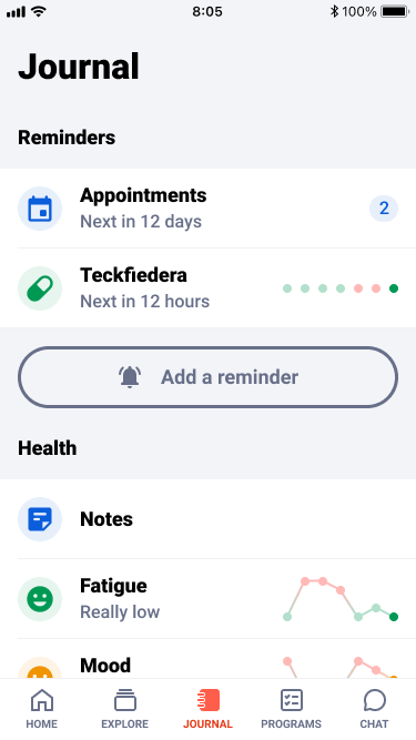
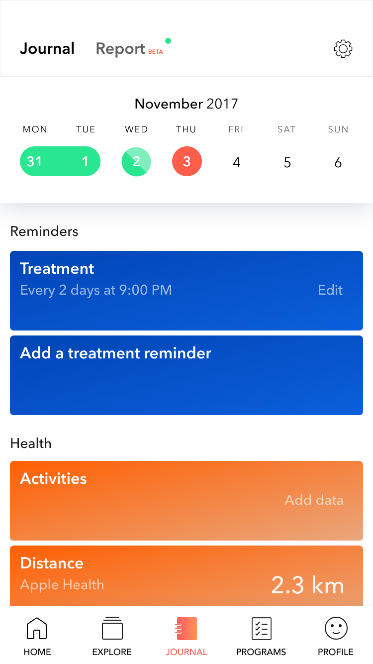
Journal
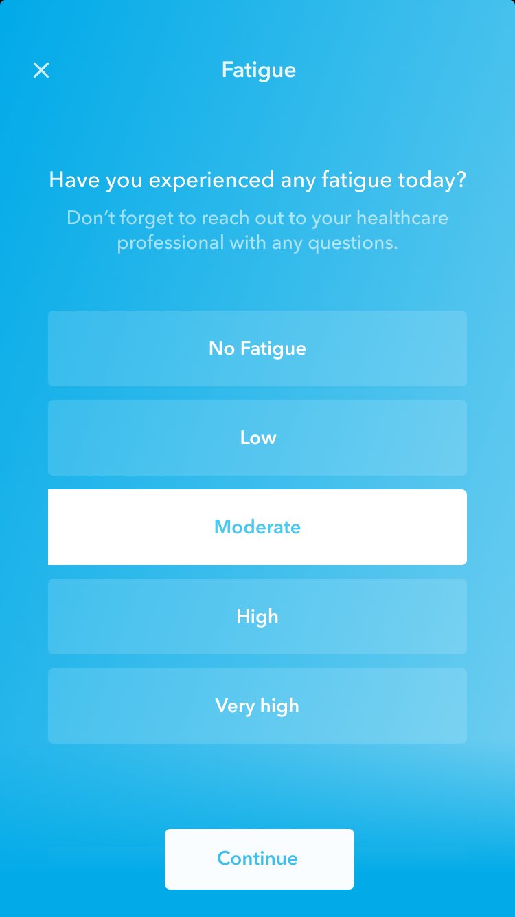
The Journal lets users quickly record daily experiences, including fatigue, cognition, mobility, vision, and other MS-related symptoms, as well as set medication reminders or appointments. Over time, it builds a personal history that helps users spot patterns, track progress, reflect on their condition, and stay engaged with routines, providing a reliable basis for self-management and clinical conversations.
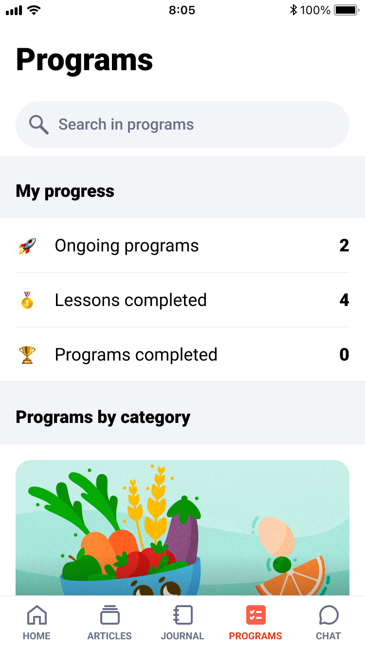
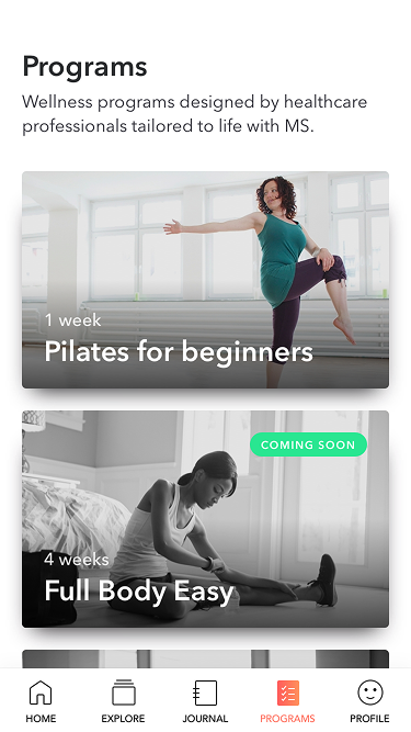
Programs
The Program section provides structured routines for well-being, including nutrition, seated exercises, fatigue management, and mindfulness, all adapted for people living with MS. Developed with health professionals, programs are safe, practical, and effective. For example, the nutrition program offers video recipes and tailored advice, while exercises can be done at home and suit varying abilities. The goal is to help users take small, consistent steps toward better health and integrate these practices into daily life.
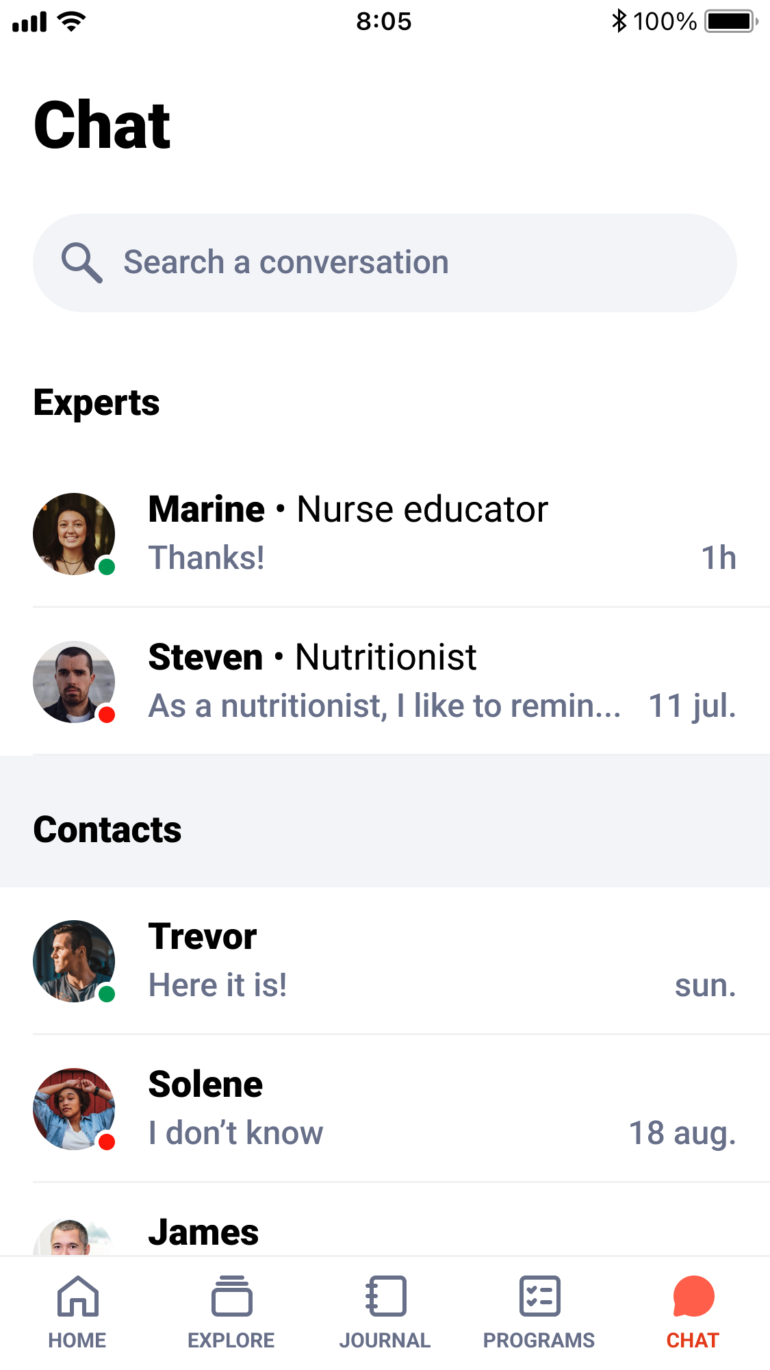
Chat
The Chat feature connects users with nurses and other specialists, such as nutritionists, for tailored day-to-day support. While not for medical prescriptions, it helps users feel guided and supported, making Cleo a true companion on their MS journey.
Improvements overview
By leveraging user feedback, data analysis, and user testing, we continuously improve the app to meet user needs and enhance usability.
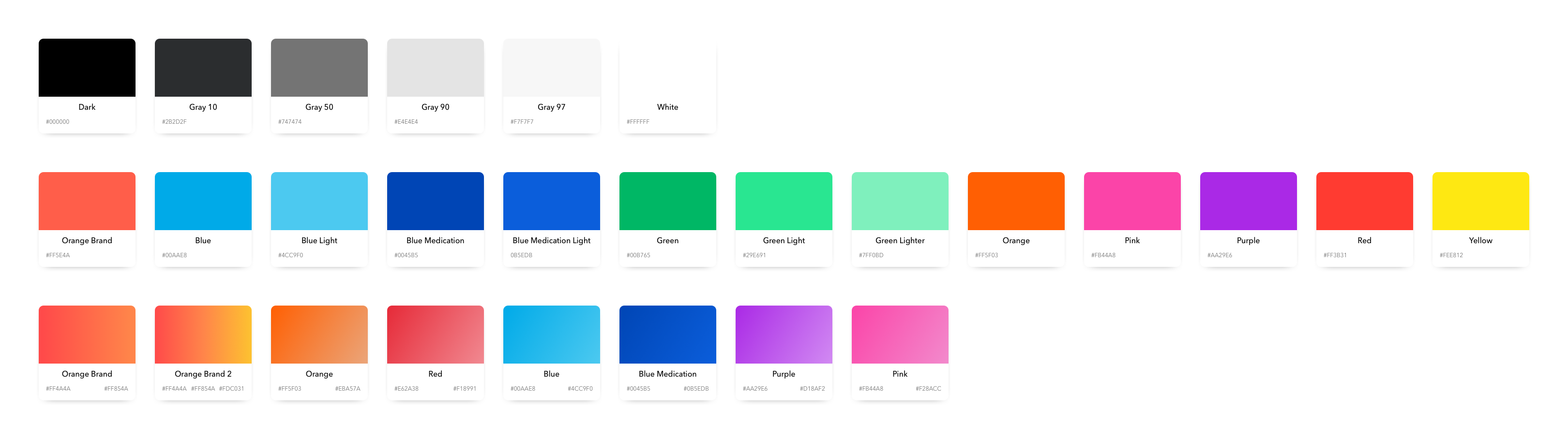
Color Simplification
To improve accessibility, we simplified the entire color system. We reduced the number of accent colors, removed gradients, and eliminated tones with insufficient contrast. This created a cleaner, more consistent visual language and ensured the interface met accessibility standards, especially for users with vision impairments.
Enhancing readability
Many MS patients experience vision or cognitive fatigue, and one recurring issue was low contrast and difficult-to-read interfaces. I improved overall readability by increasing text contrast, adjusting font sizes, and refining the hierarchy of information within each card. These adjustments made content easier to scan and reduced the cognitive load for daily use.
Art Direction
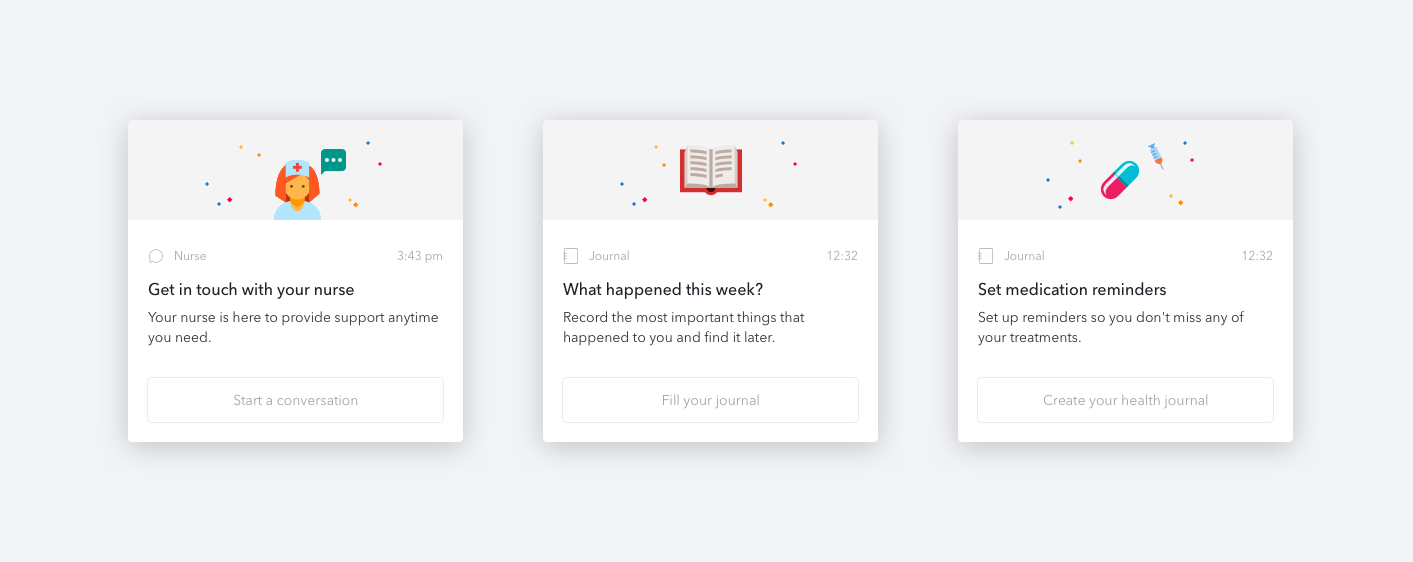
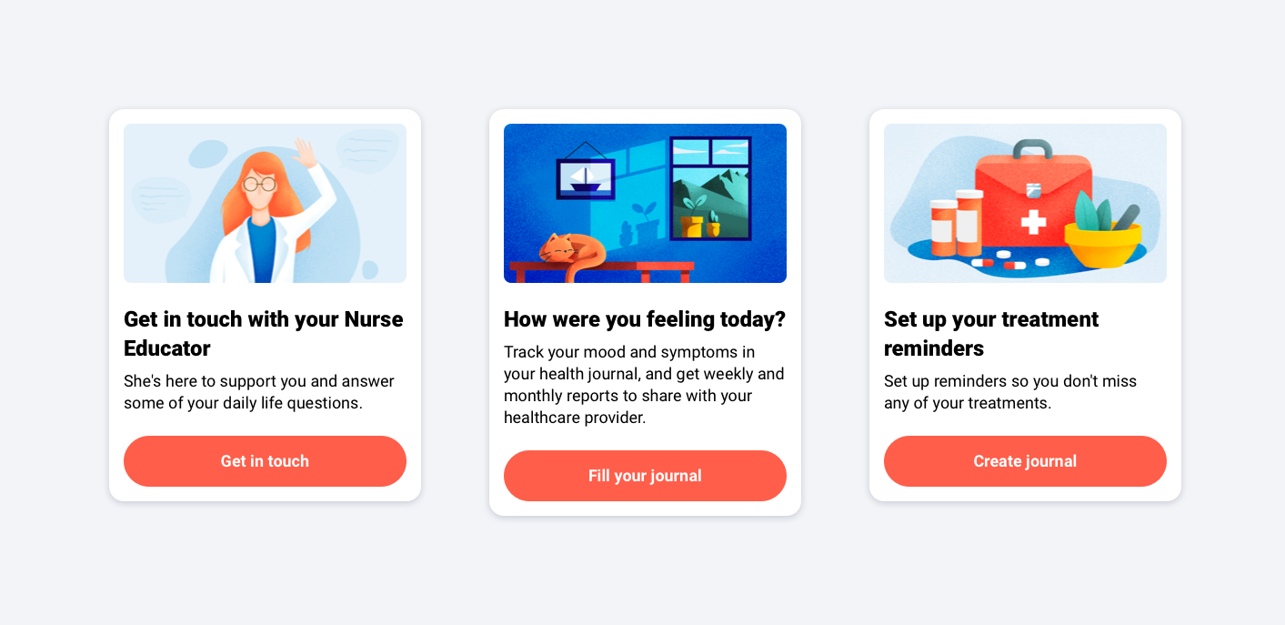
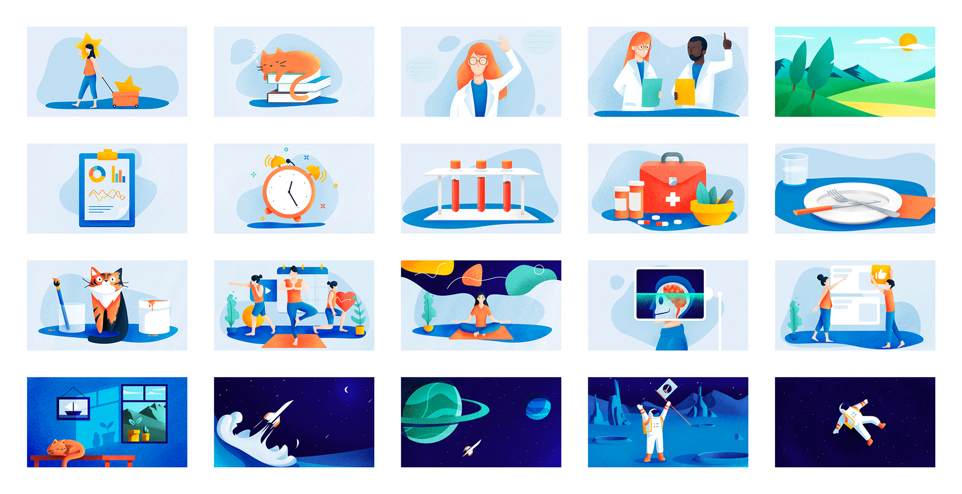
The app’s original visuals felt generic and lacked personality. I worked on creating a new set of illustrations to give the app a more distinct and approachable identity. The goal was to make the interface more engaging, guide users through the experience, and replace stock-like imagery with icons and illustrations that better reflect the app’s tone and purpose.
Redesigning the Home
Originally designed as an endless feed, the Home screen felt overwhelming and unclear for users. We reduced the number of cards and introduced clearer display rules so the screen highlighted a focused set of actions, like filling out their journal, reading a new article, or answering an MS-related quiz.
Optimizing Explore
We reworked the category system by reducing and renaming sections to make navigation clearer. We also introduced user-selected topics of interest to personalize the experience. Stock photos were gradually replaced with icons and illustrations wherever possible,
Redesigning Journal
We redesigned the Journal by shifting from a day-by-day calendar view to a tracker-based structure, making it much easier for users to see how each metric evolves over time. Each tracker now has a clear history, quick trend indicators with a color-coded scale, and the ability to create custom trackers. These changes made tracking more intuitive, more personal, and helped users better understand the progression of their condition at a glance.
Improving Programs
We expanded the Program section from a simple workout library to a more holistic set of routines. It now includes seated exercises, nutrition programs with video recipes, and mindfulness sessions, all tailored for people living with MS. These new categories make the experience more accessible and varied, while clearer progression helps users stay motivated and build consistent, achievable habits.
Case Study : The Journal
The Journal was one of the most used features, with 55% of users engaging with it regularly. This feature played a central role in retaining users, as the most loyal users came back to the app primarily to use it. This case study focuses on simplifying tracking and making it easier for users to reflect on their daily experiences, based on feedback from users across multiple countries and validated through user tests.
Home-to-Journal: Starting point
We observed that users who engaged with the Journal showed significantly higher retention and engagement. A key goal was to encourage usage and make tracking more accessible from the Home hub. In the original flow, tapping the Journal card opened a full-screen sequence that forced users through every tracker in order, often feeling long, confusing, and restrictive.
Home-to-Journal: First Iteration
To address the context-breaking issue of the first iteration, we introduced a bottom-sheet design that allowed users to fill trackers without leaving the Home screen. This helped users stay oriented and reduced confusion compared to the full-screen flow.
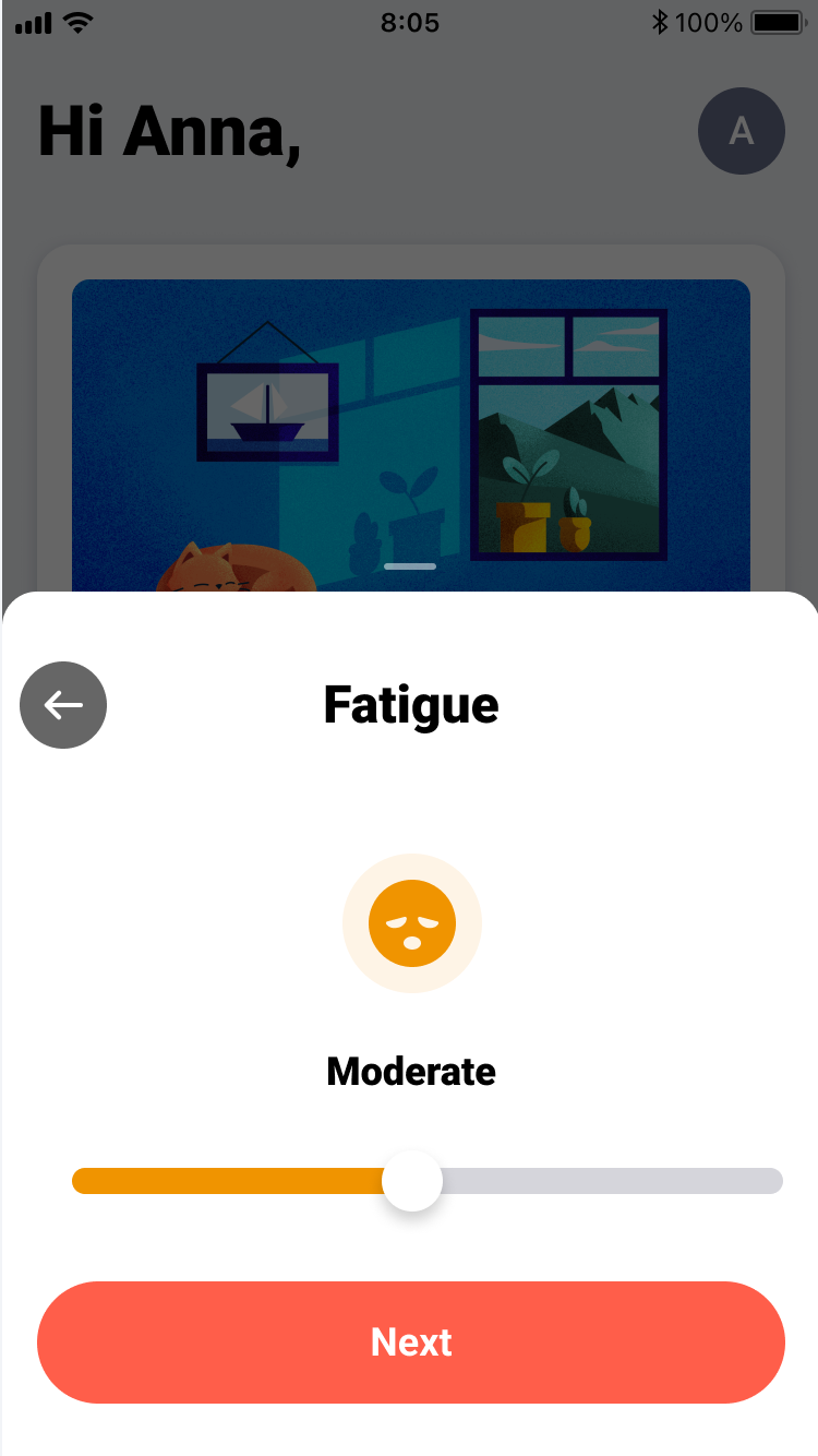
We tested this version in user sessions using realistic, interactive prototypes. This revealed that the slider interaction, while visually appealing, introduced accessibility challenges for users with limited dexterity.
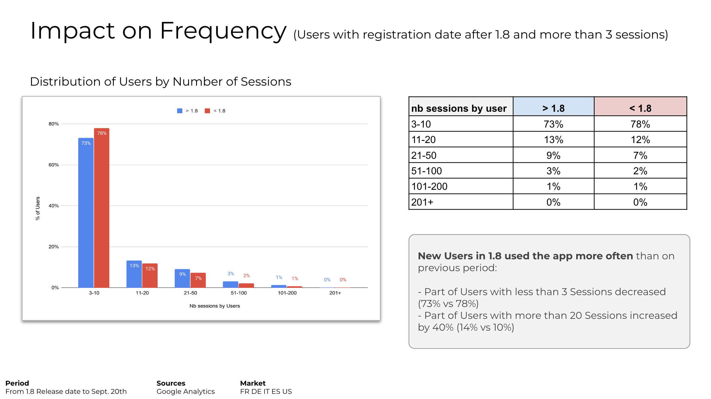
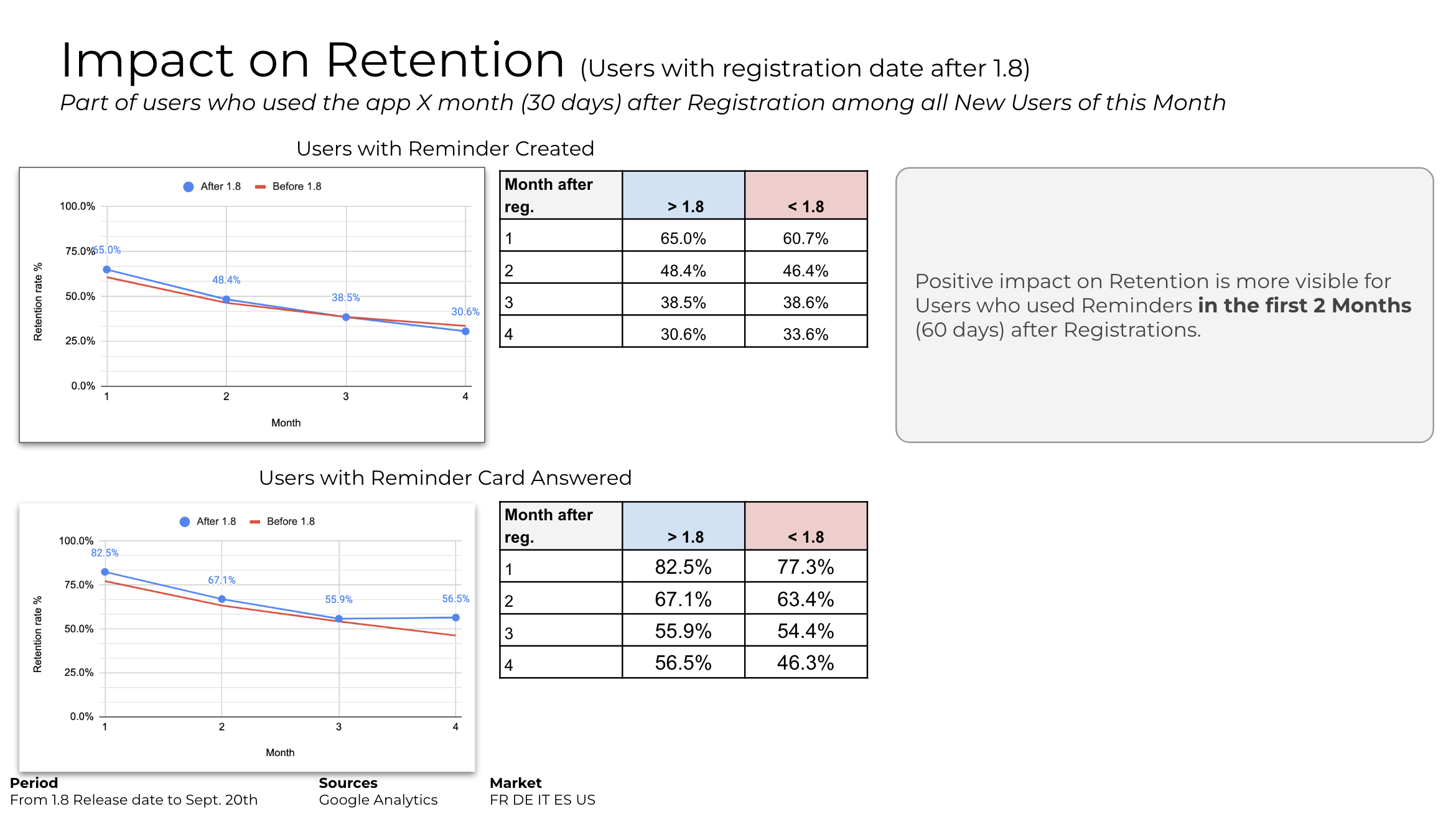
Impact
The introduction of the new Tracker Card on Home had a strong positive impact on New Users. It significantly increased early engagement with the Journal, making new users more likely to start tracking and return during their first weeks. This single entry point also showed potential spillover effects, encouraging exploration of other features such as Articles, Quizzes, and Patient Stories.
This boost in activity created a larger segment of Potential Loyal Users, showing that the Journal, when surfaced clearly on Home, has real power to drive both usage and retention.
The next challenge is to convert these highly engaged newcomers into long-term Loyal Users by reinforcing this momentum through continued visibility and simple, low-friction interactions.
Documentation
To ensure the app was implemented accurately and consistently, I developed comprehensive documentation covering all key areas. This included detailed user flows for core scenarios, screen-by-screen guidelines specifying layouts, spacing, typography, and colors, and micro-prototypes for complex interactions. Together, these resources served as a single source of truth for developers, reducing errors and maintaining visual and functional consistency across the entire product.
Flows
I created detailed flows describing each scenario: adding, editing, and reviewing trackers, managing treatments, writing notes, handling reminders, and more. These flows ensured developers had a precise blueprint for how the Journal should work in every situation.
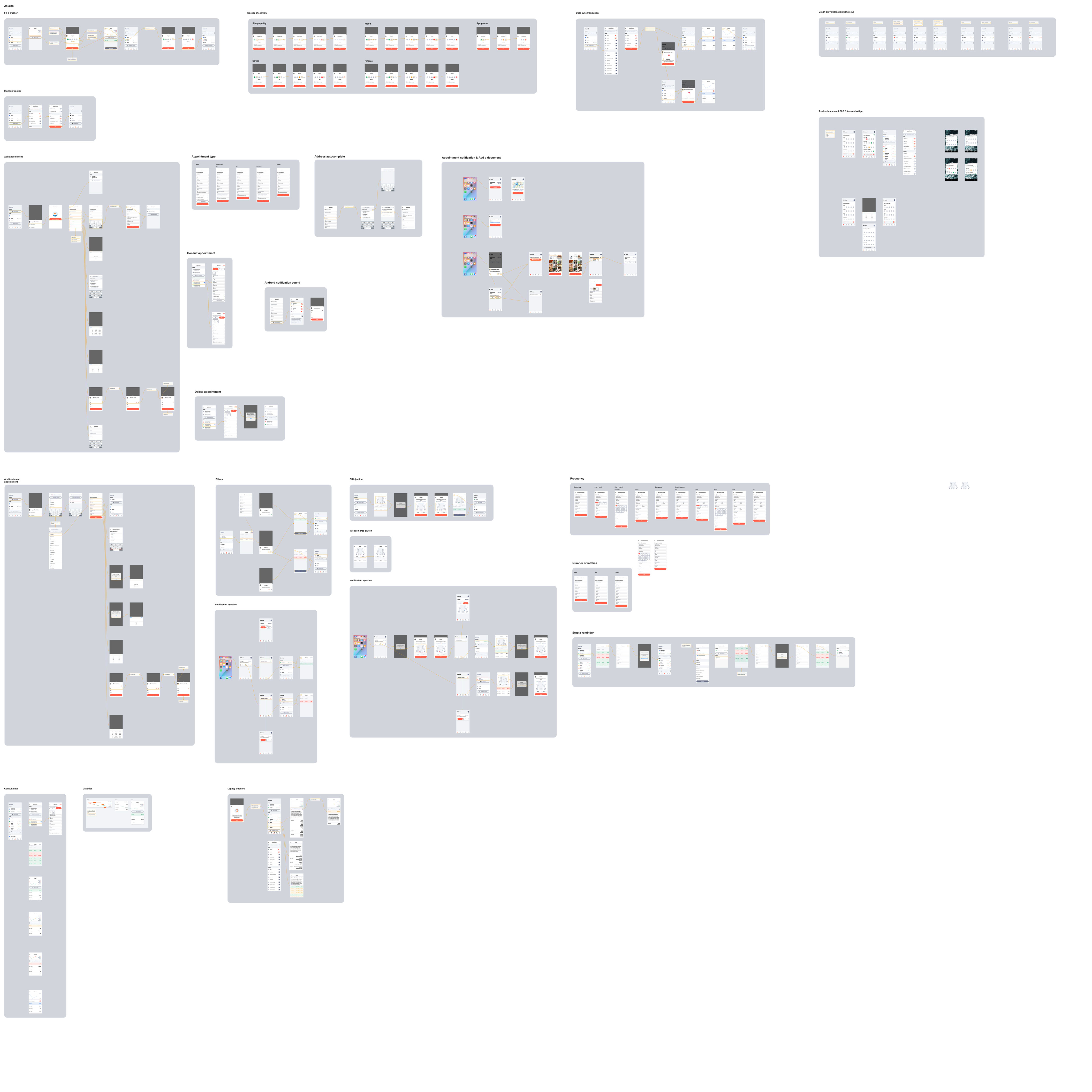
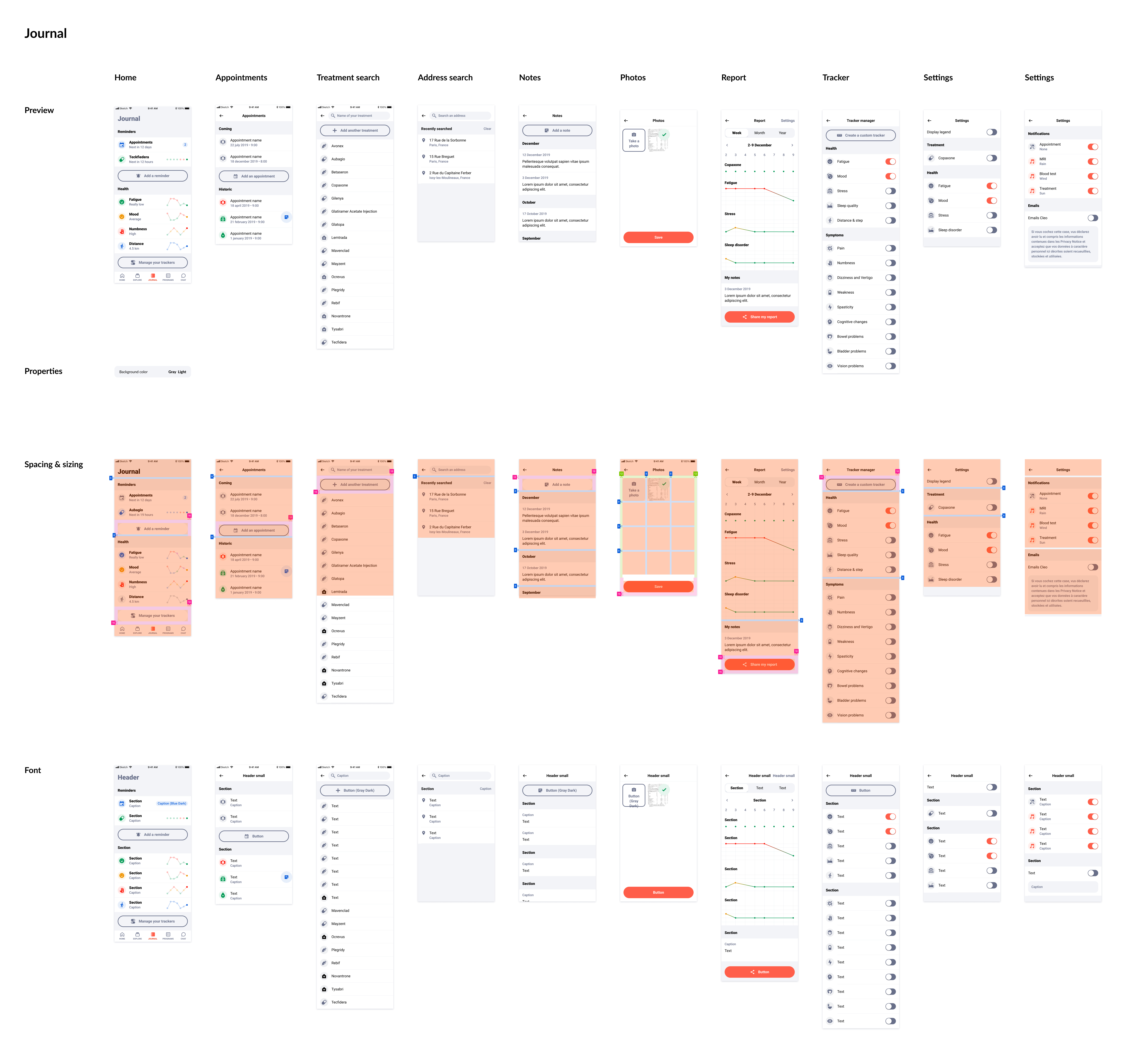
Guideline
I created fully detailed specifications for each screen of the app.
Every layout element was documente: spacing, typography, colors, and any special notes.
This screen-by-screen approach acted as a single source of truth for developers, helped prevent copy-paste inconsistencies, and made it easier to spot small visual mistakes that could slip through (like inconsistent spacing, copied elements with wrong values, typo mismatches, etc.). It also ensured the entire product stayed visually coherent as new features were added.
Prototype
For more complex behaviors such as animations, transitions, thresholds, or edge cases, I built micro-prototypes focused on specific interactions. These clarified ambiguities and ensured consistency across the app, especially in areas where written specs were insufficient.
Legal review
Because this project involves people's health, the legal review process is really heavy.
Whenever there is a new release, for each country, every single screens of the application has to be reviewed by a legal team before it can be released. Every time we design a new screen or change an existing one (wording, imagery, UI,...) we have to make a review before it goes to development.
Create a new process
To simplify the legal review process, we developed a method to automatically generate PDFs containing all screens with accurate wording. This significantly sped up reviews and saved a lot of time for the teams.
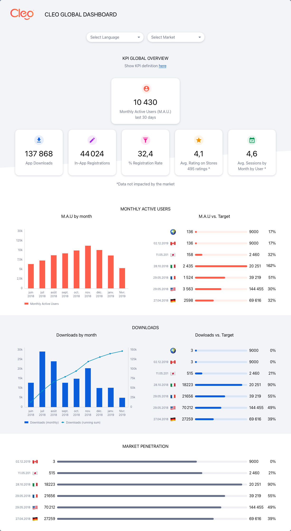
Analytics Dashboard
I helped the data team create a visually appealing Google Analytics dashboard, making key metrics easy to read and understand at a glance.