Context
Territoires Fertiles is a web platform that provides accessible content, stories, and a concise Diagnostic Flash to help non-experts understand local food resilience. In parallel, CRATer delivers detailed data, indicators, and interactive maps for specialists. Although both platforms support the same mission, they had inconsistent interfaces, navigation patterns, and page structures. Users struggled to move between the two ecosystems, making it difficult to explore, compare, and act on the information.
Mission
My work focused on two key areas:
- Conducted a UX audit to identify navigation issues, structural inconsistencies, and opportunities to unify Territoires Fertiles and CRATer
- Explored several redesign directions to improve clarity, flows, and overall usability.
Tool used
 Figma
Figma Users
This project needed to address two distinct groups with different needs.

Non-experts
Elected officials, citizens, and new project manager. Need clear narratives, accessible diagnostics, and contextual insights. They want to understand the big picture without being overwhelmed by raw data.

Specialists
Territorial agents, consultants, project leaders, and journalist. Rely on detailed indicators, comparisons, simulations, and downloadable charts. They seek precision, transparency, and trustworthy scoring.
Audit
The audit aimed to fully understand the user experience across both platforms and revealed that the main pain points were Visual & UI issues and Navigation issues.
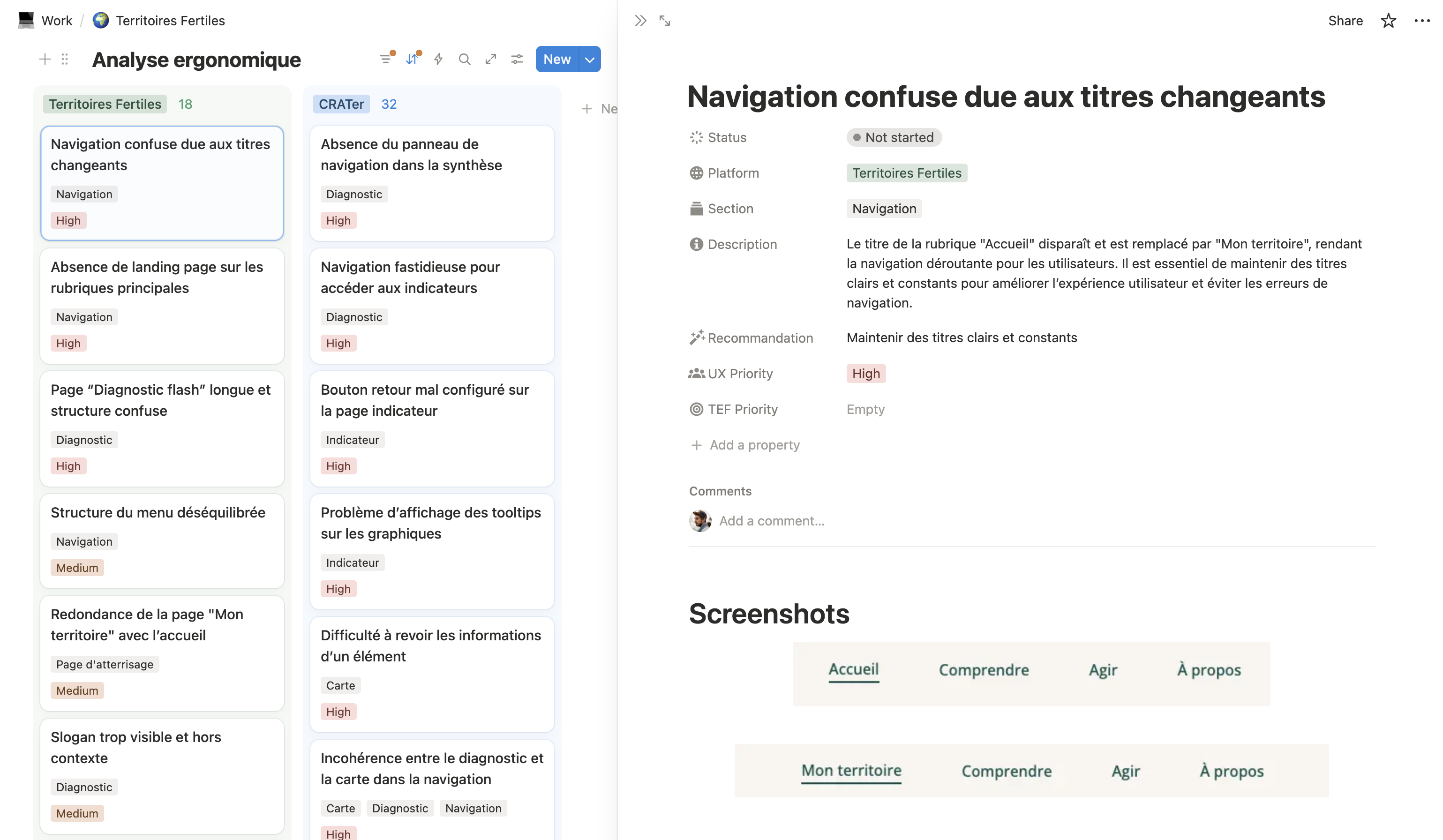
Documentation
All findings were fully documented in Notion, creating a shared, actionable reference for the entire team and guiding the redesign process. For each issue, I captured:
- The problem
- The severity level
- A recommended solution
- Screenshots or short video captures illustrating the friction
Visual & UI issues
Although Territoires Fertiles had a strong visual direction, inconsistencies created friction, making it harder for users to navigate and understand the platforms:
- Iconography varied in style and weight
- Illustrations followed different visual languages
- Colors were applied inconsistently across sections
- Typography and spacing lacked uniformity across pages
- Multiple button styles created visual confusion
Navigation Issues
Navigation across both platforms was confusing, creating friction that hindered users from exploring, comparing, and understanding the content effectively:
- No clear landing pages for major sections
- Top menu was unbalanced and inconsistent
- Contextual navigation was limited
- Returning to the previous context in CRATer was difficult
- Many external links pulled users away from the experience
Explorations
After identifying all major navigation issues during the audit, the team asked me to explore whether cartography could become the central entry point of the platform.
First screens
I started by combining screenshots and interface elements from the existing platforms to quickly test layouts and interactions. This “Frankenstein” approach allowed me to explore different arrangements and identify promising directions without spending time recreating everything from scratch.
After a few explorations, I became more comfortable with the layout and visual style. This gave me a solid foundation to start designing the first interactive flow.
First Flow
I created an initial flow to validate the core navigation concept. Users start by selecting a territory from the map, then each diagnostic category opens in its own panel. Panels include three tabs: Understand, Assess, Act, while the map remains visible and updates as indicators change.
Strategy
The redesign strategy focused on refining and unifying the experience without starting from scratch. The goal was to simplify navigation and improve clarity while preserving the existing visual style, fonts, and colors.
Nuxt UI
The team was already using the Nuxt UI component library, so the redesign had to work within this existing system.
Colors
I reworked the main colors (green, orange, sandy beige) and their shades to preserve brand identity, integrate with the Nuxt UI palette, and ensure better readability across charts, maps, and UI components.
- Sandy beige: mid-to-dark shades lacked contrast
- Green: shades too similar in brightness, hard to distinguish
- Orange: dark shades too contrasting compared to the rest of the palette
Icons
I chose an icon library already available within Nuxt UI to ensure direct integration, maintain stylistic consistency, improve readability, speed up implementation, and avoid adding any extra technical complexity.
Iteration I
I designed all key screens and mapped flows between them to illustrate:
- Core user journeys and use cases
- Micro-interactions and hover states
- Different content states and transitions
- Interaction between panels, menus, and the map
Core concept
From the home page, users could either explore foundational content about food resilience or search for a territory directly.
Once a territory is selected:
- The main menu switches to a reduced, territory-focused version
- A contextual side panel updates based on the active tab
- An interactive map remains visible to support orientation and comparison
Map Interaction
The map allows users to:
- Navigate between administrative divisions (regions, departments, communities)
- Compare their territory to neighboring areas
- See contextual information on hover
- Update indicators in real time across the diagnostic panels
Merging Themes & Diagnostic Categories
A key idea was to merge diagnostic categories with thematic articles:
- Many categories and themes overlapped in content
- Simplifying the menu reduced redundancy
Now, each diagnostic category panel contains three tabs:Understand, Assess, Act
This structure creates a single, coherent experience where users can move from context to data to action without losing focus.
Lessons from the Map-Centric Concept
After presenting the map-centric concept in real, interactive screens, the team realized it wasn’t the approach they wanted long-term.
Key reasons:
- Themes and diagnostic categories may diverge and expand independently.
- More articles and new themes would make the merged model less scalable.
- The map, while useful for initial navigation, took too much space once inside a category and became less necessary.
Seeing the concept in practice helped the team confirm that a classic three-pillar structure (Understand/Assess/Act) with cartography integrated inside the assess section, was the more robust and flexible foundation.
Iteration II
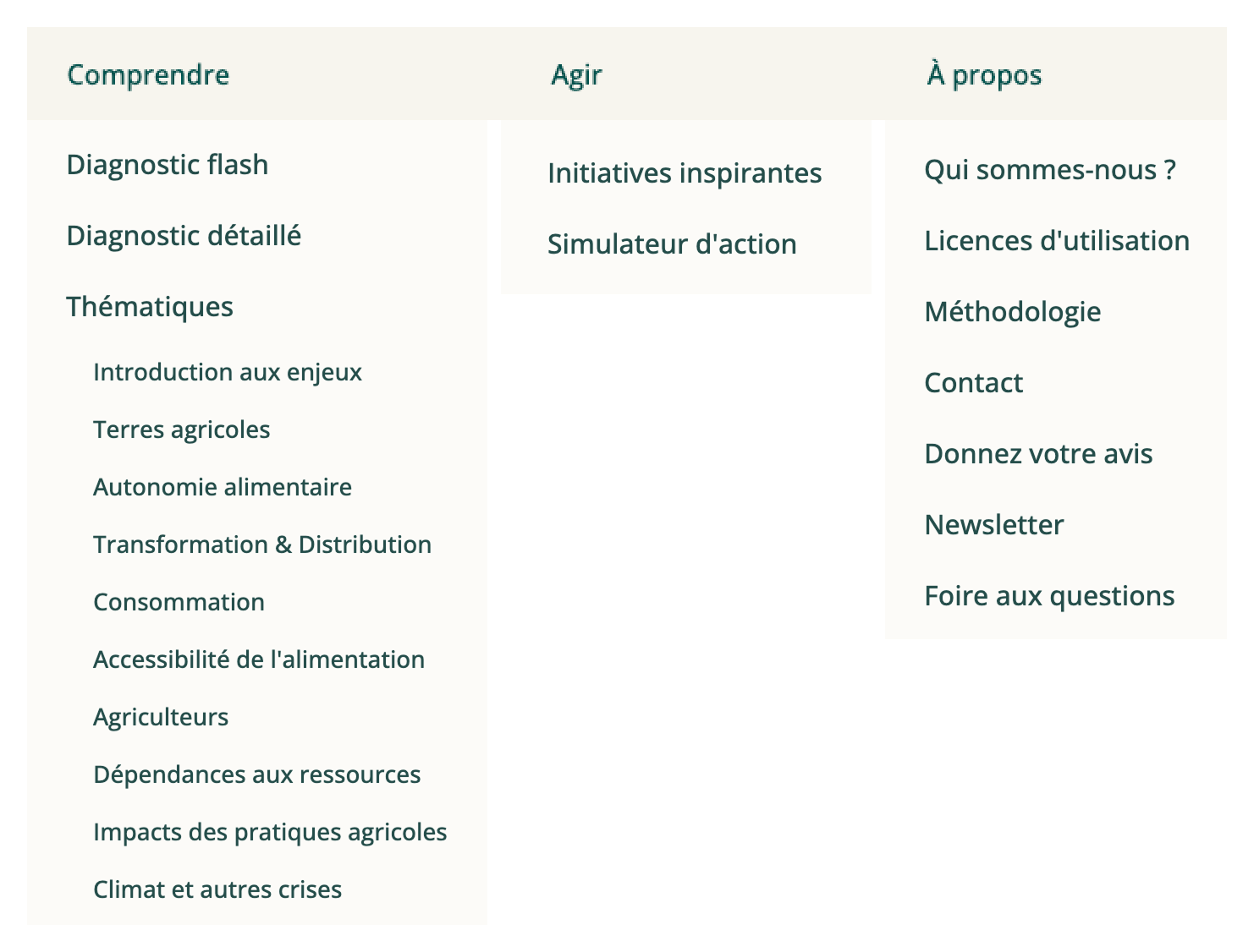
After the first iteration, the team aligned around a clearer, more classic structure, dividing the platform into three main sections:
- Understand: stories, pedagogy, and contextual content
- Assess: Diagnostic Flash, CRATer data, and maps
- Act: inspirations, tools, resources, and methods
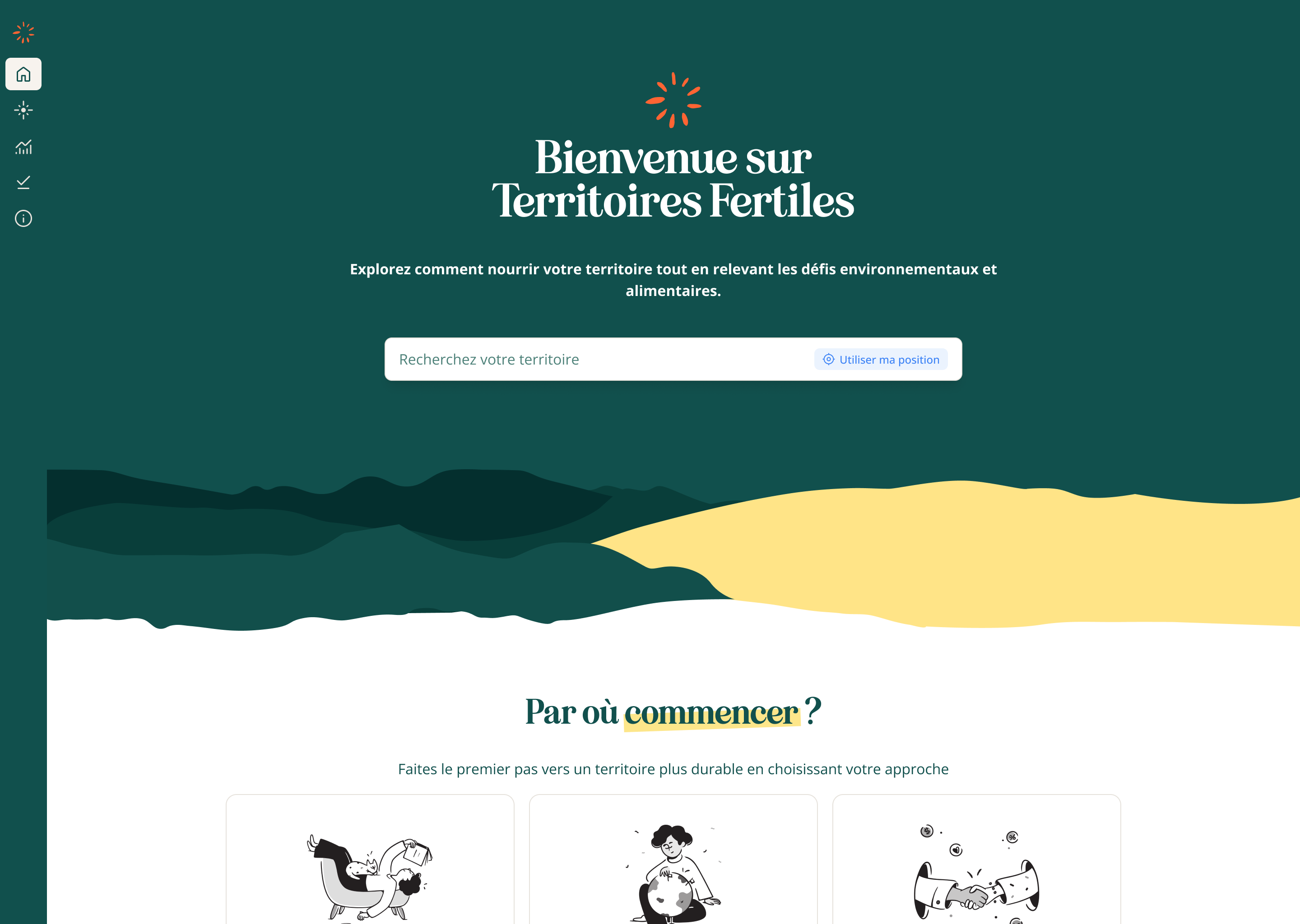
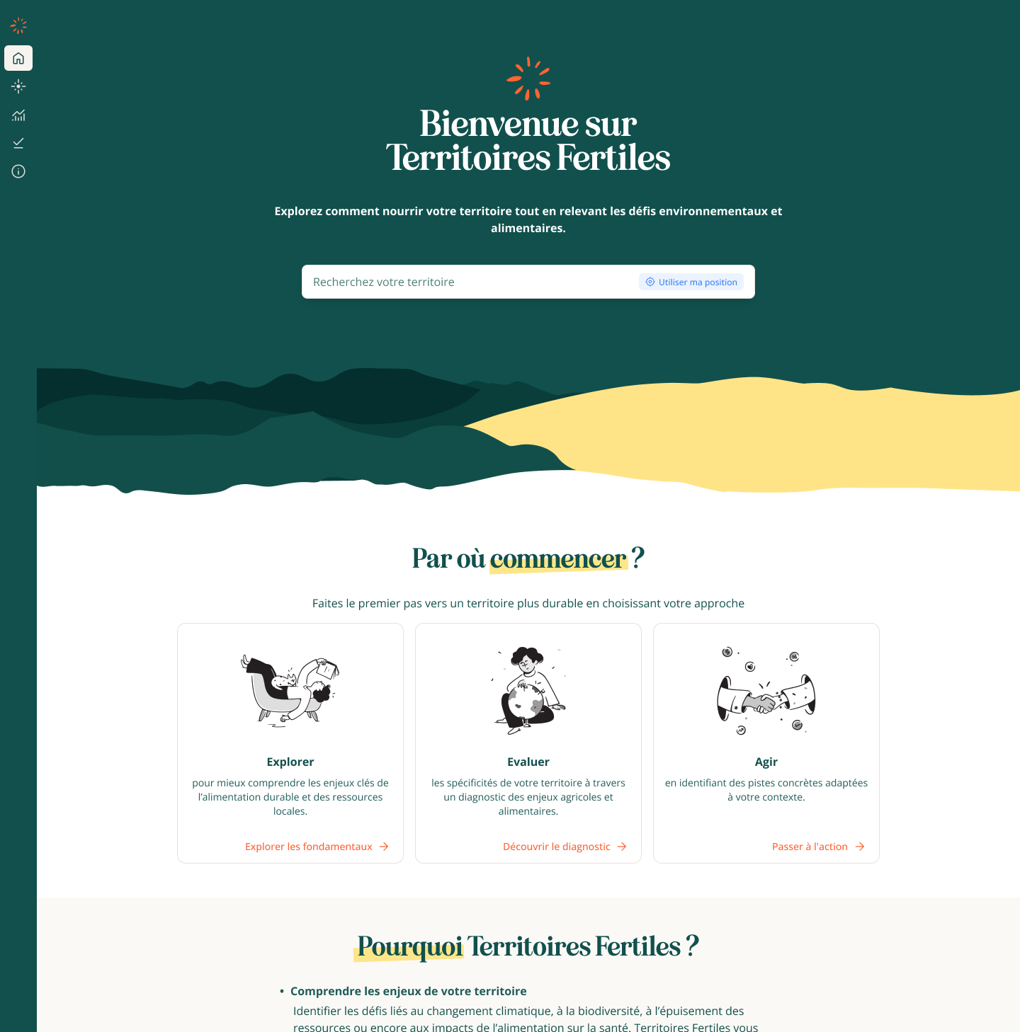
Home
The home page lets users start their journey in the way that best fits their goal or level of expertise. They can dive directly into one of the three pillars (Understand, Assess, or Act) or search for a specific territory to explore its data and insights in depth.
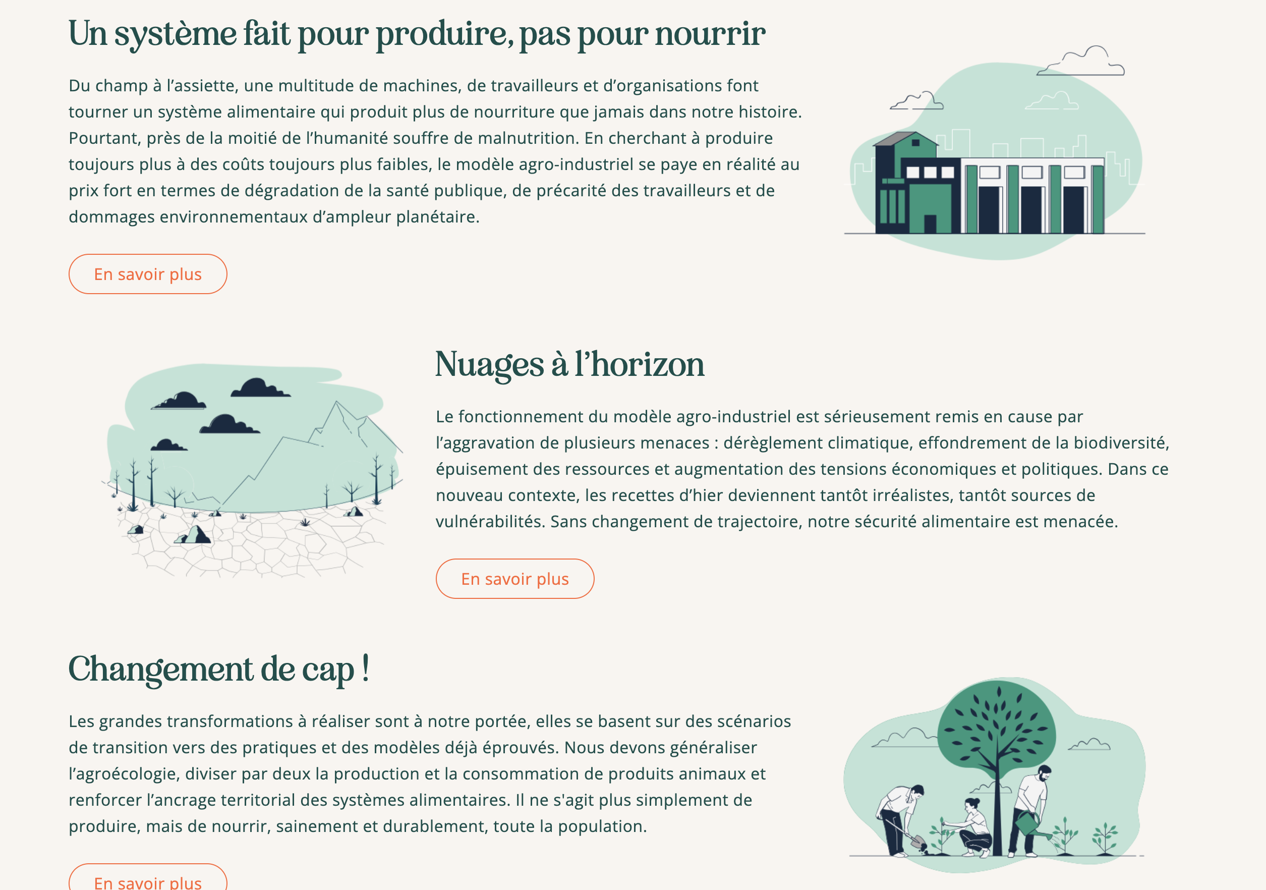
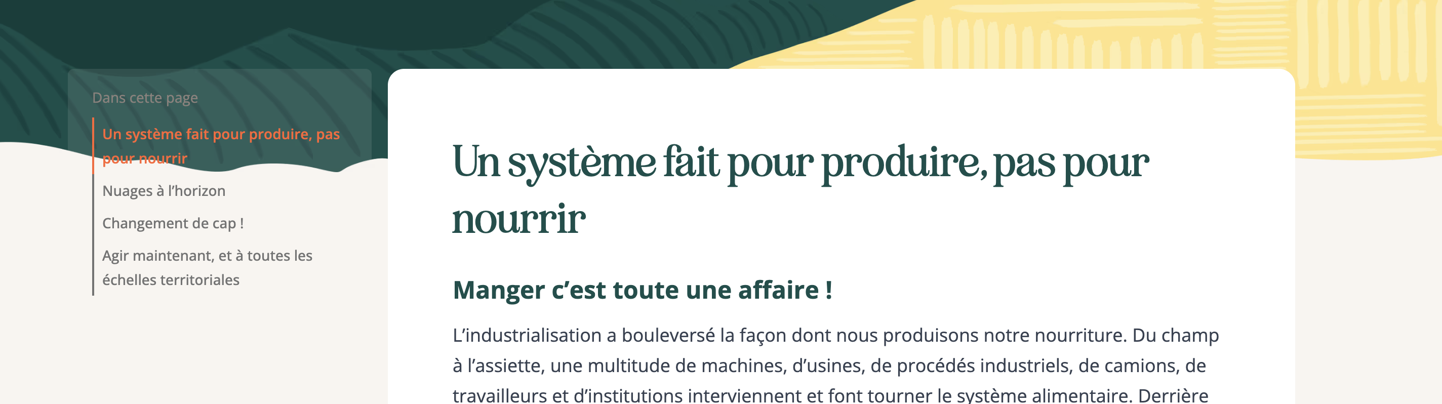
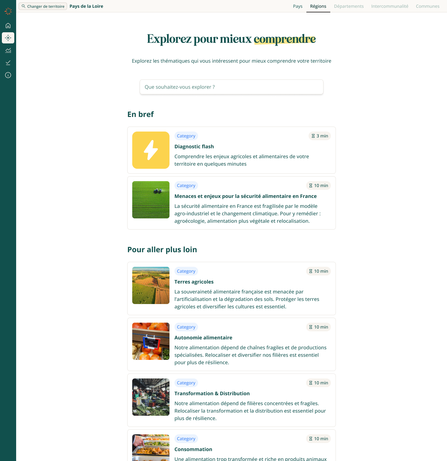
Understand
The goal of the Understand section is to help users grasp the stakes of food resilience before they engage with data. The content is intentionally general, narrative, and pedagogical, making the topic accessible to all audiences.
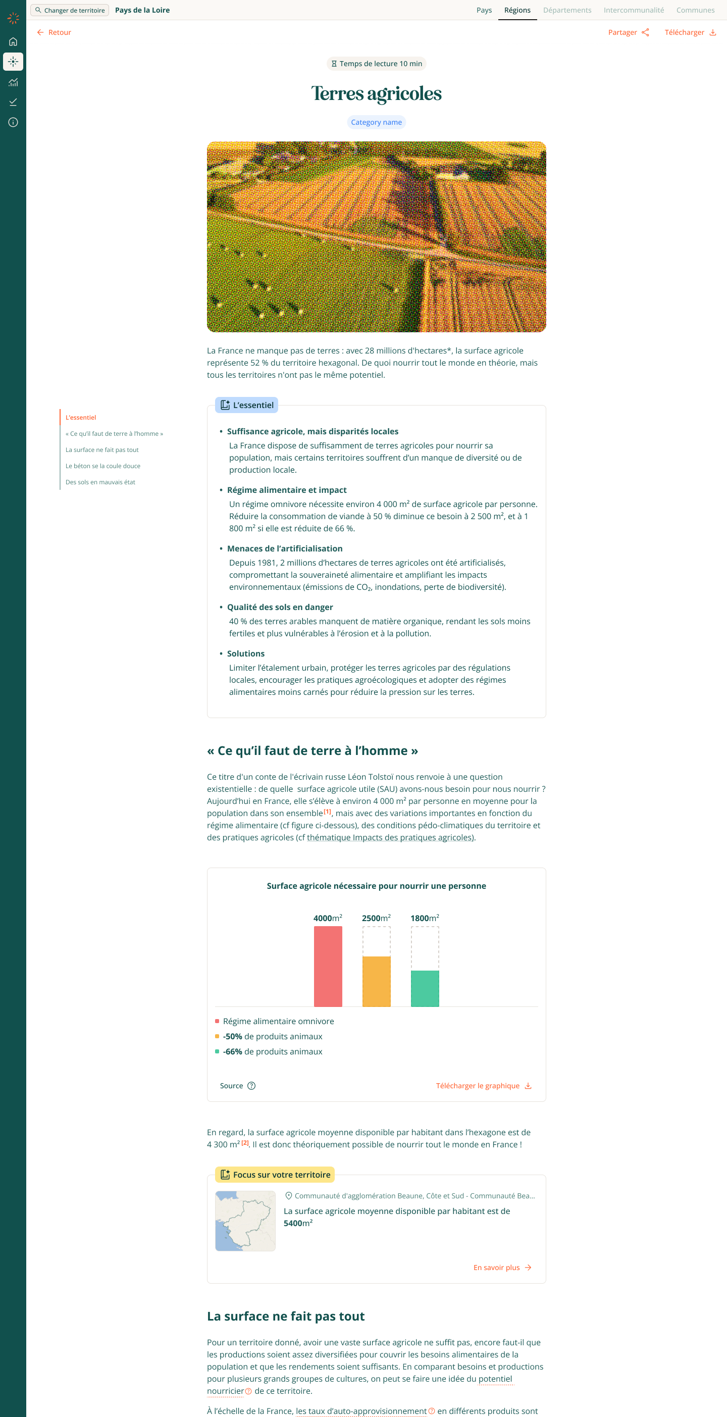
Article
When a territory is selected, the articles enrich themselves with contextual inserts: key figures, maps, charts, and diagnostic highlights tied to that specific territory.
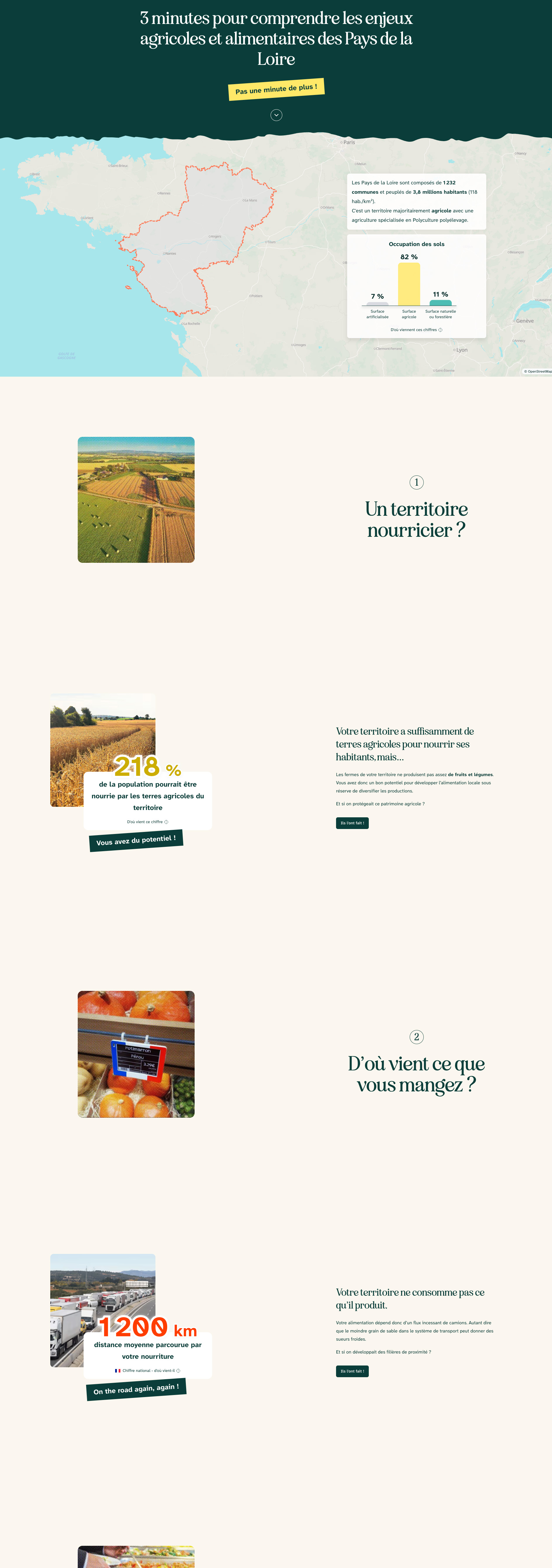
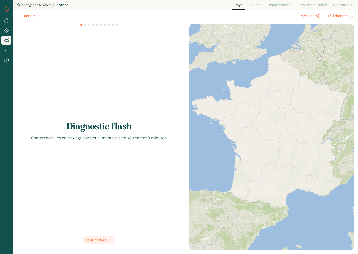
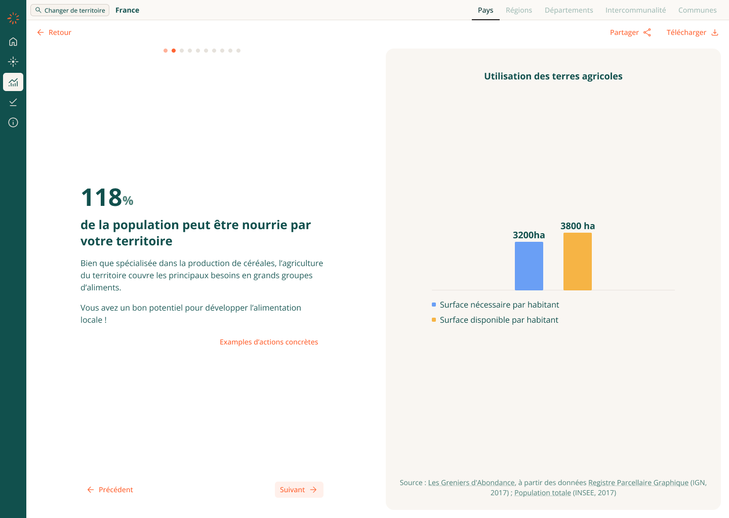
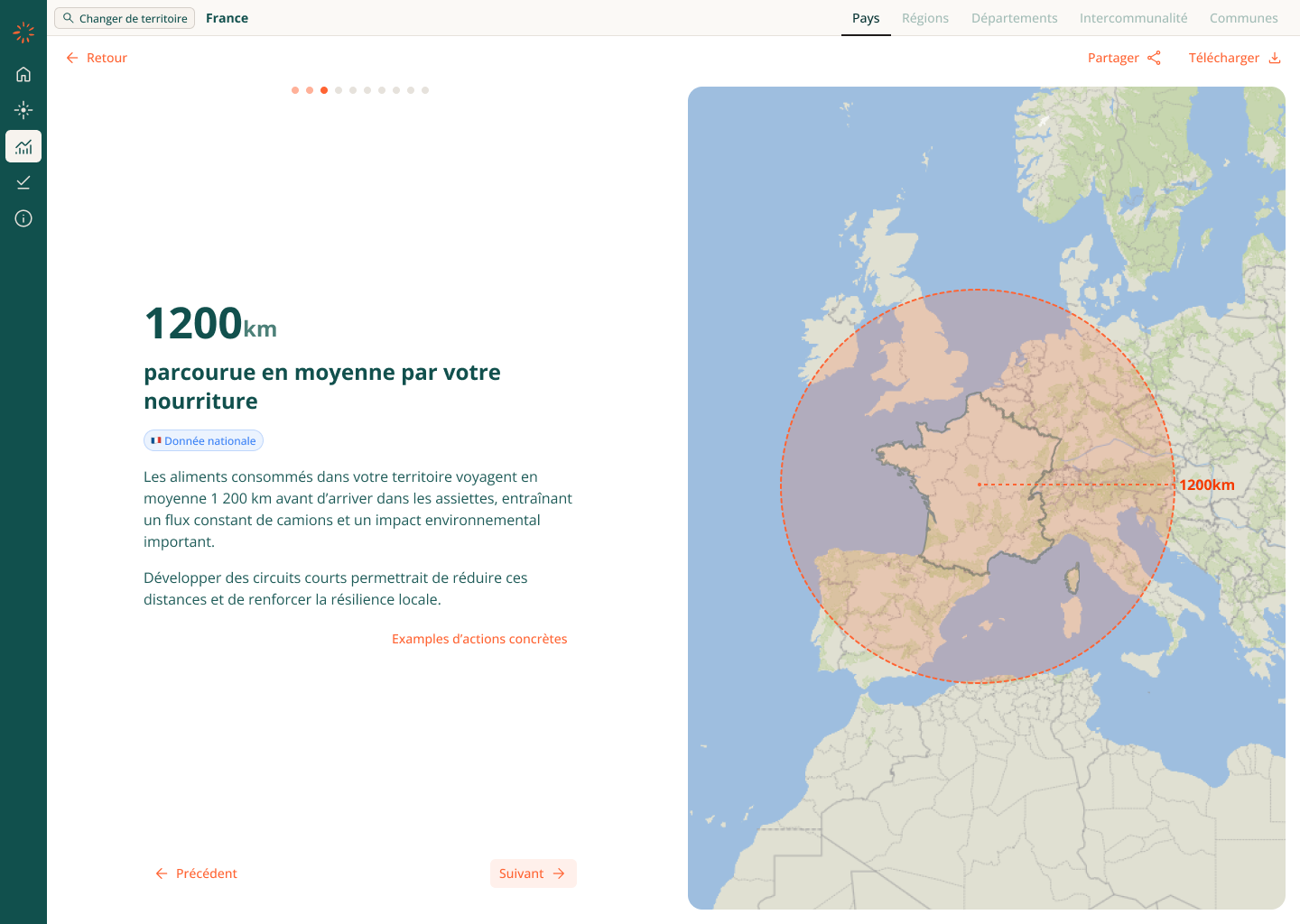
Diagnostic flash
The original Diagnostic Flash was long, sparse, and fatiguing: lots of empty space made users scroll extensively, even though the actual content was limited.
The redesign:
- Breaks content into clear, digestible sections
- Improves chart readability and contextual explanations
- Creates a slide-like flow that mirrors the downloadable version, so navigation feels consistent and scannable
- Makes the page easier to scan and understand without endless scrolling
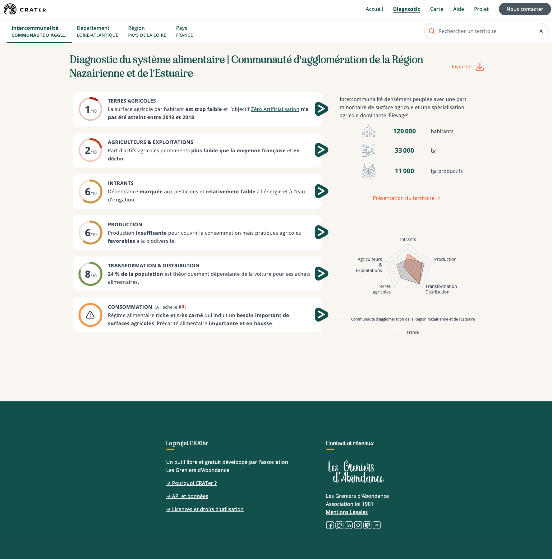
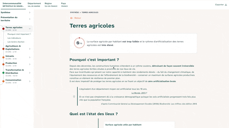
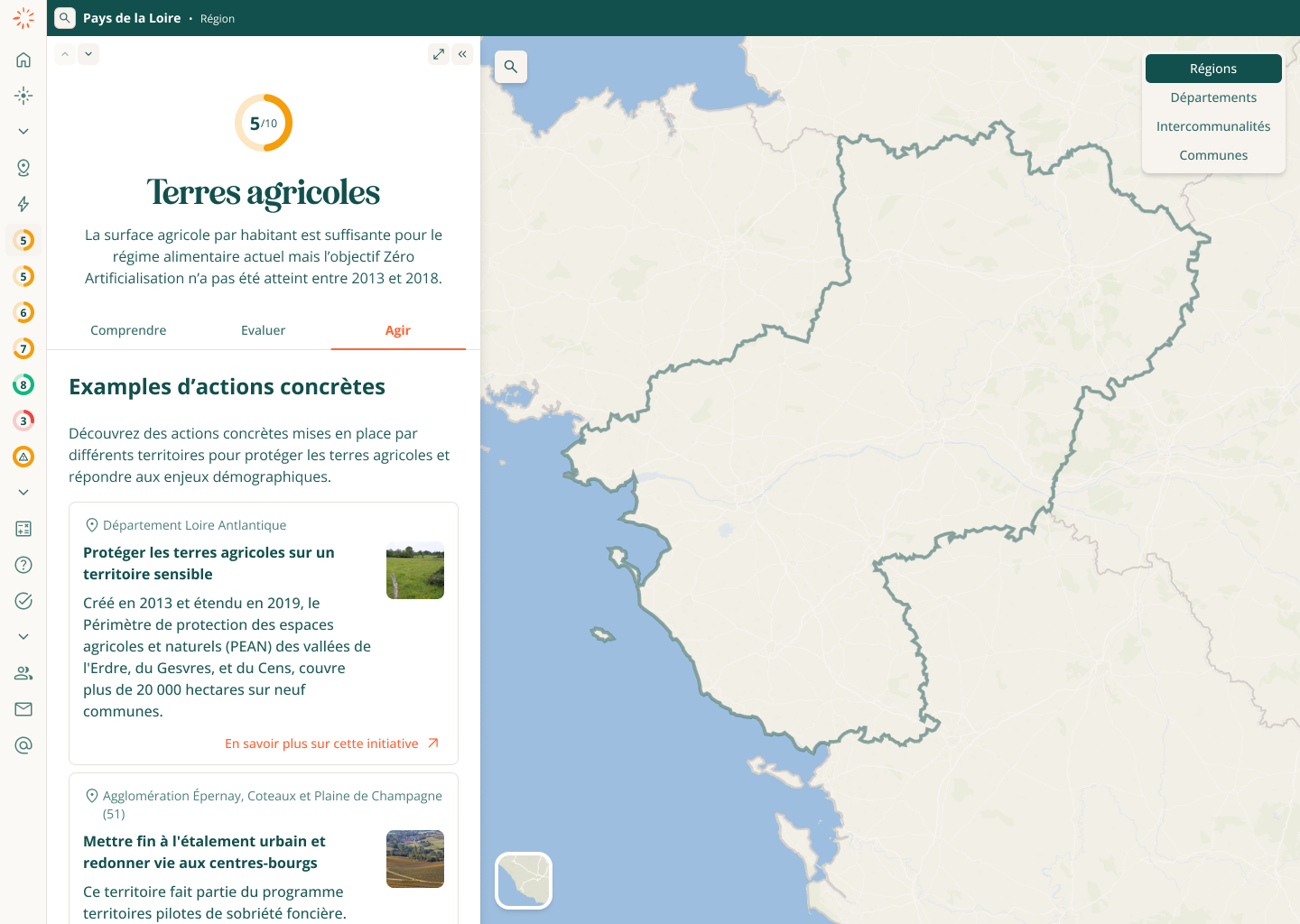
Assess
The Assess section helps users evaluate their territory objectively, even without data expertise. It begins with a summary page that highlights key figures and offers clear entry points into each category. understand.
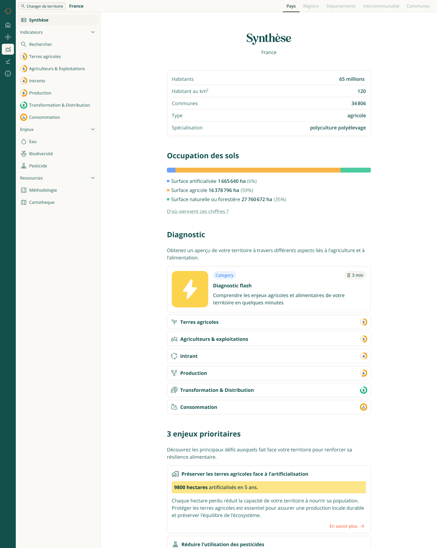
Categories are scored from 1 to 10, with indicators labeled as poor, average, or good, making vulnerabilities easy to spot and
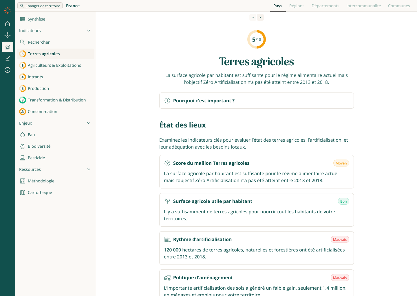
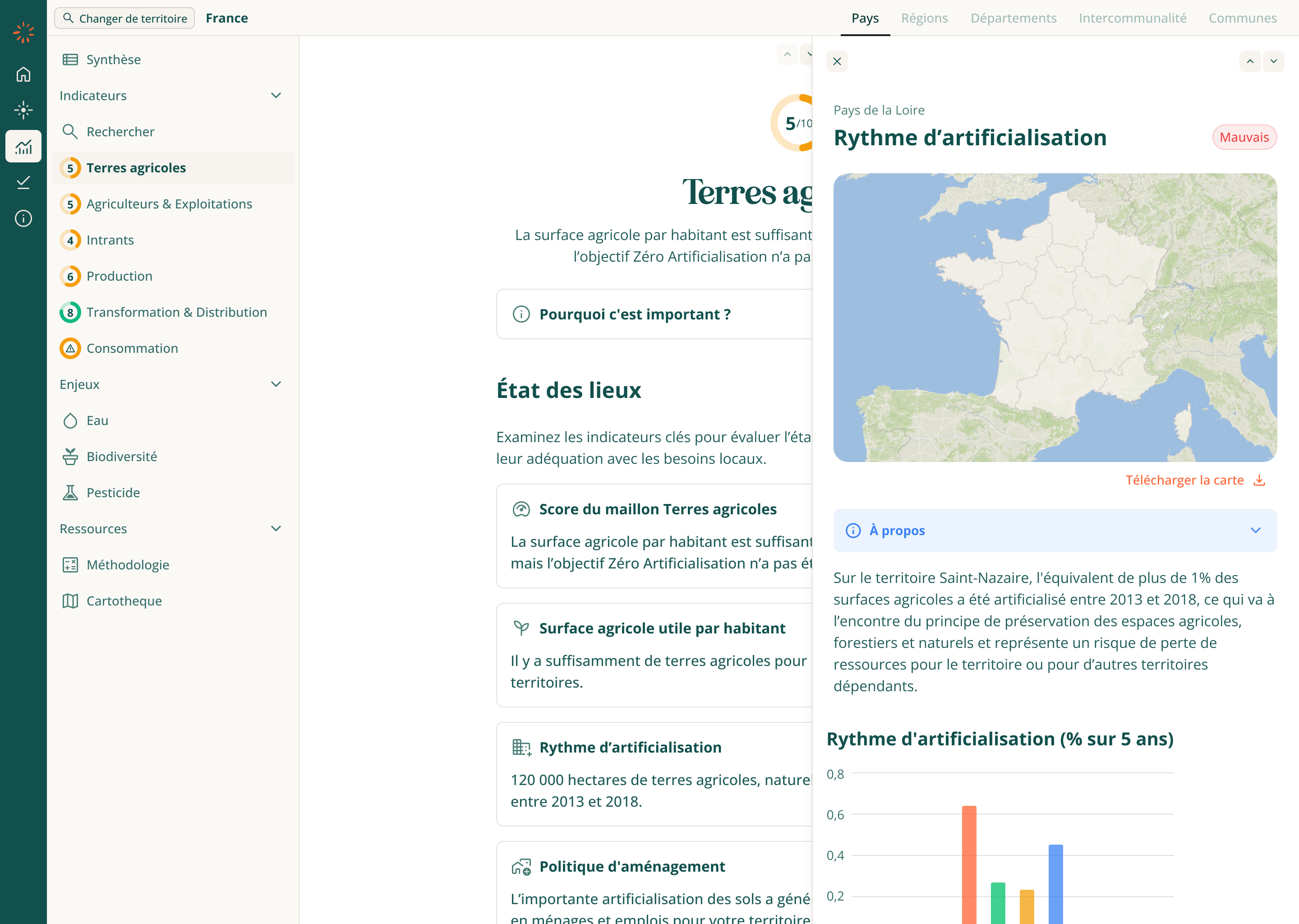
For deeper exploration, selecting an indicator opens a side panel rather than a new page, preserving context while displaying definitions, charts, maps, and methodology. This approach reduces cognitive load and creates a smoother, more intuitive assessment flow.
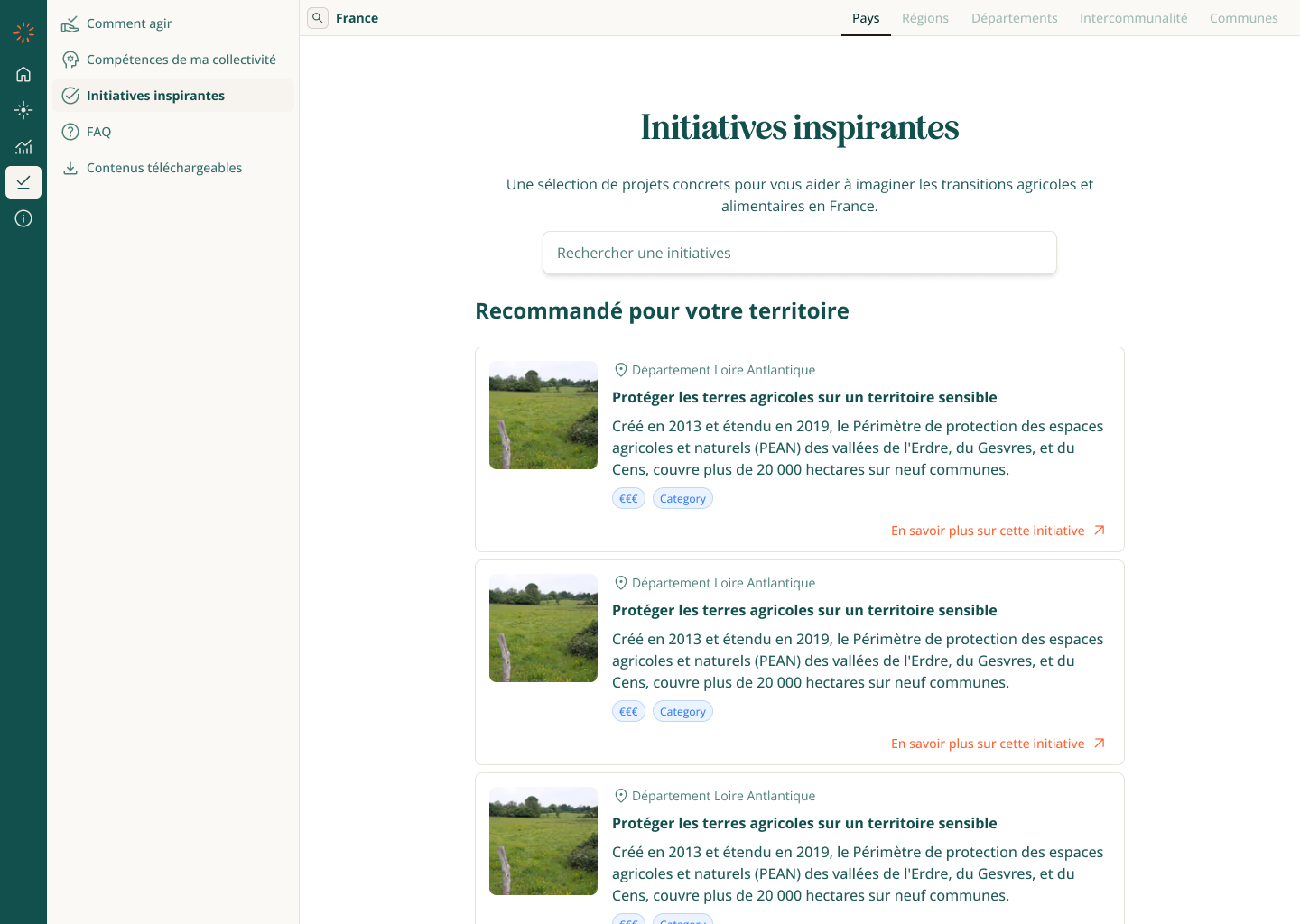
Act
The Act section brings together all the resources territories need to move from diagnosis to action. It includes practical guidance, collective skills mapping, inspiring case studies, FAQs, and downloadable toolkits.
At this stage, the structure was defined but much of the content was still being shaped with stakeholders. The long-term goal is to create a clear bridge between analysis and implementation, ensuring territories not only identify their challenges but also know how to act on them.
Conclusion
The redesign clarified and unified the platforms, creating a clear structure and intuitive flows. While not fully implemented, it laid a strong foundation for future development.