Context
Biogen, a pharmaceutical company specializing in neuroscience, created BHS (Biogen Healthcare Solution) to design, develop, and deliver innovative digital solutions for patients with neurological diseases and healthcare professionals. Cleo is one of these solutions—a mobile app designed to support people living with multiple sclerosis (MS) and their communities.
MS is a condition that affects the brain and spinal cord. While there is no cure, treatments can help manage symptoms and slow disease progression.
Mission
I joined the BHS team in March 2018, when the app's design was complete, and development had started. My responsibilities included:
- Representing Cleo at MS conferences to gather user feedback.
- Designing dashboards for the data team.
- Creating assets for app stores, including screenshots and promotional videos.
- Building design systems based on the existing design.
- Documenting changes for legal reviews.
- Improving the app based on store reviews, user testing, and data insights.
- Developing mockups and user flows for new features.
- Creating custom illustrations and interactive prototypes for user testing.
- Producing detailed video prototypes for developers to describe animations or specific behaviors.
- Providing comprehensive guidelines for developers and content teams.
- Conducting quality assurance (QA) to ensure high product standards.
Tool used
 Sketch
  Zeplin
  Framer
  Flinto
  Invision
  Photoshop
  Illustrator
  After Effect
 App overview
Cleo helps people with MS by offering information, support, and tools to manage daily challenges. The app has four main sections—Explore, Program, Journal, and Chat—plus a Home screen as a shortcut hub.

Home
A central hub for quick access to different sections of the app.

Explore
The Explore section provides articles and videos to help users live better with MS. This includes reliable health information, patient stories, and practical advice. Content can be personalized to match user preferences.

Journal
The Journal allows users to log symptoms, mood, sleep quality, fatigue, and physical activity. They can generate reports to share with their healthcare team and set up medication reminders or appointments.

Wellness programs
This section offers tailored exercise and wellness programs created by health professionals, including yoga, meditation, and sitting exercises.

Connect with nurse educators
Users can contact nurse educators with extensive knowledge of MS for advice and answers to questions about living with the condition.
App improvements
By leveraging user feedback, data analysis, and user testing, we continuously improve the app to meet user needs and enhance usability.
Enhancing readability
MS patients often face vision challenges, and one significant issue was low contrast and readability. I addressed this by improving color contrast and font sizes throughout the app.


Redesigning the Home Screen
Initially designed as an endless feed, the Home screen was confusing for users. I transformed it into a to-do list to improve clarity and functionality.


Optimizing Explore
The Explore section was redesigned to highlight content categories and showcase its diversity.


Illustrations
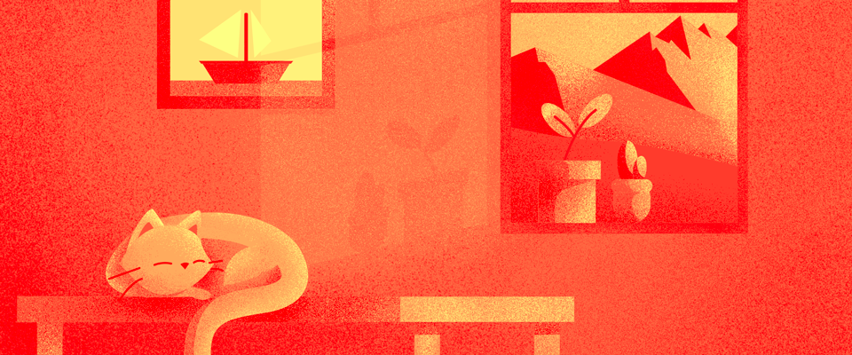
The app's original illustrations lacked personality. I created a new set of illustrations to give the app a unique identity and make it more engaging.

Prototyping
We conducted monthly user tests with 7–8 participants living with MS, using different types of prototypes depending on the test's complexity:
Simple interaction
Tools like InVision were used for straightforward prototypes, especially for remote testing.
Complex interaction
For detailed interactions and animations, I used tools like Flinto or Framer Studio during on-site tests.
Guidelines
To ensure the app aligns with design standards, I provided detailed specifications for the engineering team.
Flow
Comprehensive flow diagrams illustrated user journeys and warnings for clarity.

Board
Screens were accompanied by guidelines for fonts, colors, and spacing.

Video
Specific animations or behaviors were documented through videos.
Legal review
Because this project involves people's health, the legal review process is really heavy.
Whenever there is a new release, for each country, every single screens of the application has to be reviewed by a legal team before it can be released. Every time we design a new screen or change an existing one (wording, imagery, UI,...) we have to make a review before it goes to development.
Create a new process
Given the app's focus on health, the legal review process was stringent. For every new release, all app screens had to be reviewed by a legal team in each country. I developed a process to generate PDFs containing all screens with accurate wording, streamlining the review process.
